About responsive tables
- Applies to:
- All versions
- Role required:
- Draft Contributor
If you created tables prior to July 14, 2016 (the release date of responsive tables), those tables need to be re-formatted to become responsive. Older or copied tables may need to be converted to responsive.
In NiCE KM, newly created tables are automatically set to responsive so that they resize and better fit screens for mobile devices. This means you reach more of your audience by having your content look good on all devices. A responsive table displays differently on smaller screens based on a few factors such as column headers, row headers and number of columns.
Column headers
For responsive tables with column headers, the headers will move to the left of the table with their content table cells displayed to the right when viewed on a smaller screen.
Large screen view

Small screen view

Row headers
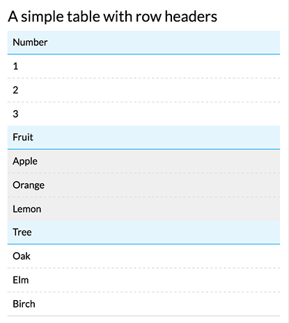
For responsive tables that use row headers, the table displays move the headers above the row inputs when viewed on a smaller screen.
Large screen view

Small screen view

No headers
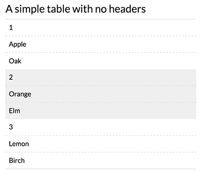
Similar to the column header display, when a responsive table has no headers, the content will shift to a single column, vertical display when viewed on a smaller screen.
Large screen view

Small screen view

More than five columns
If your responsive table consists of more than five columns, it will switch to the smaller screen display around tablet size.
Large screen view

Medium screen view

Row and column headers
We do not recommend using both row and column headers with the responsive table setting. That type of table display is difficult to render well in smaller screen sizes. When used with the responsive option, tables are rendered with only column headers visible.
