Miscellaneous element mockups
- Applies to:
- NiCE Knowledge Management (current)
- Role required:
- N/A
The layout and features of miscellaneous elements will change based on the device that they are displayed on. Use the following mockups while creating your site design so you can customize all aspects of the following and maintain a consistent and reliable design.
Screen sizes
Responsive device size breakdown used in NiCE KM. Approximated pixel values displayed alongside their em units for easier reference.
- Large Desktop (87.5 em = 1400 px)
- Desktop (80 em = 1280 px)
- Laptop (65.25 em = 1044 px)
- Tablet - landscape (50 em = 800 px)
- Tablet - portrait (37.5 em = 600 px)
Miscellaneous element views
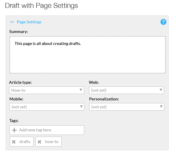
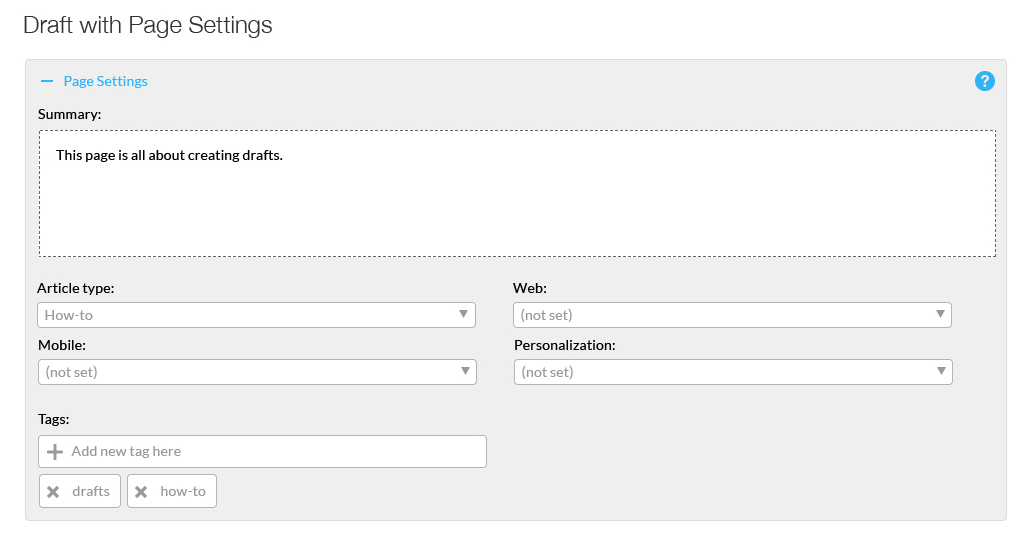
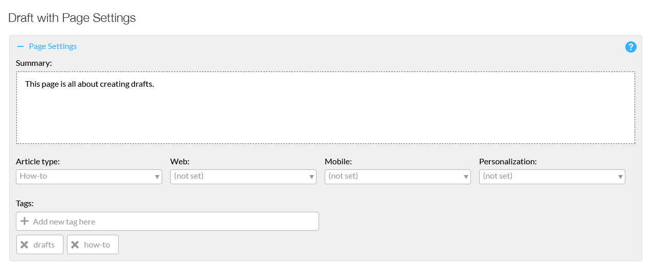
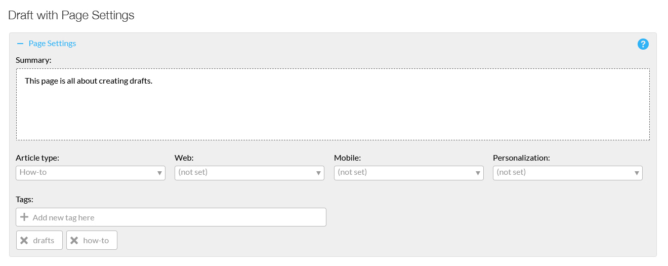
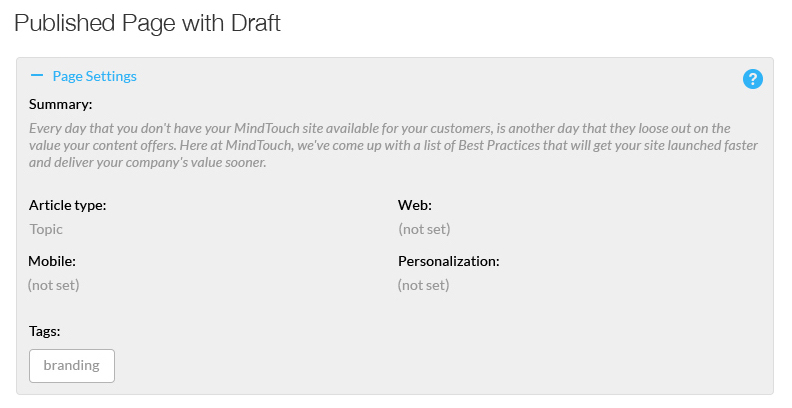
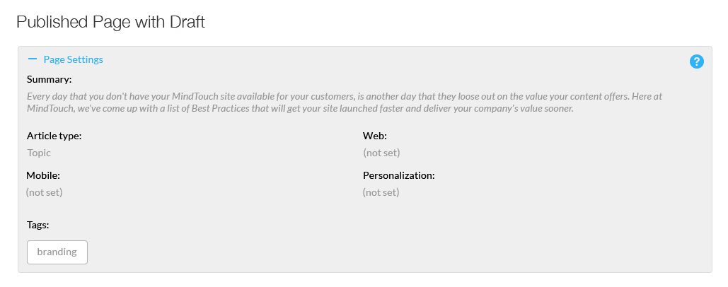
Page setting views
While page settings are only visible by pro members, there are slightly different views based on whether the article is a live page or a draft. Page settings are not visible in mobile sized views.
Download: Page settings.zip
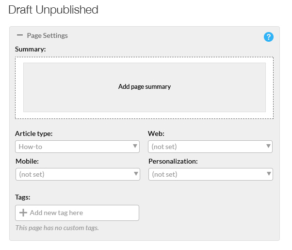
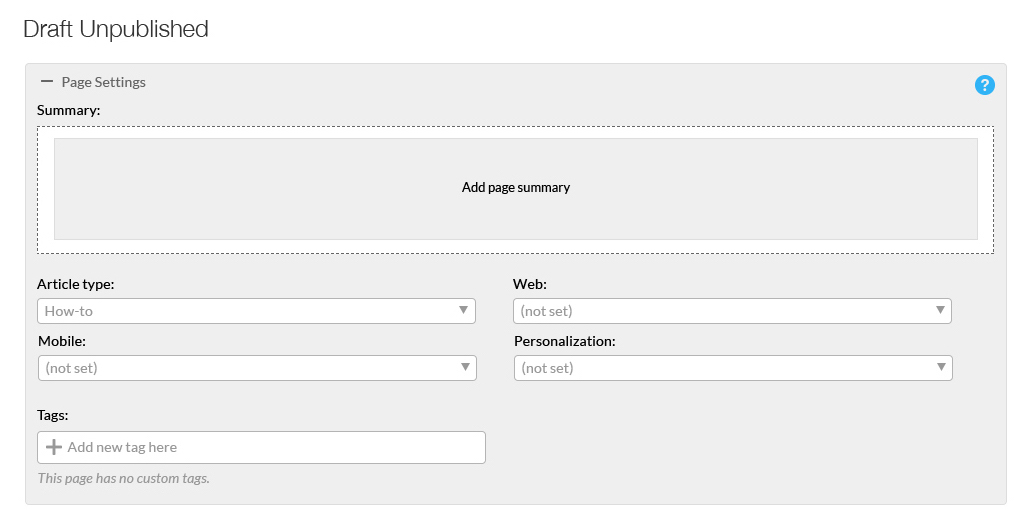
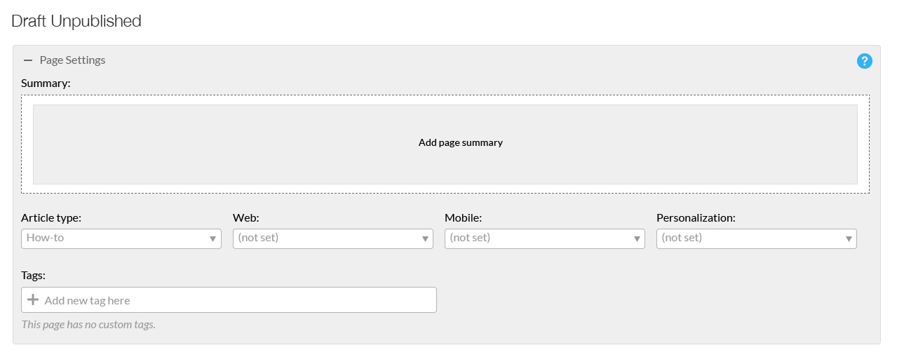
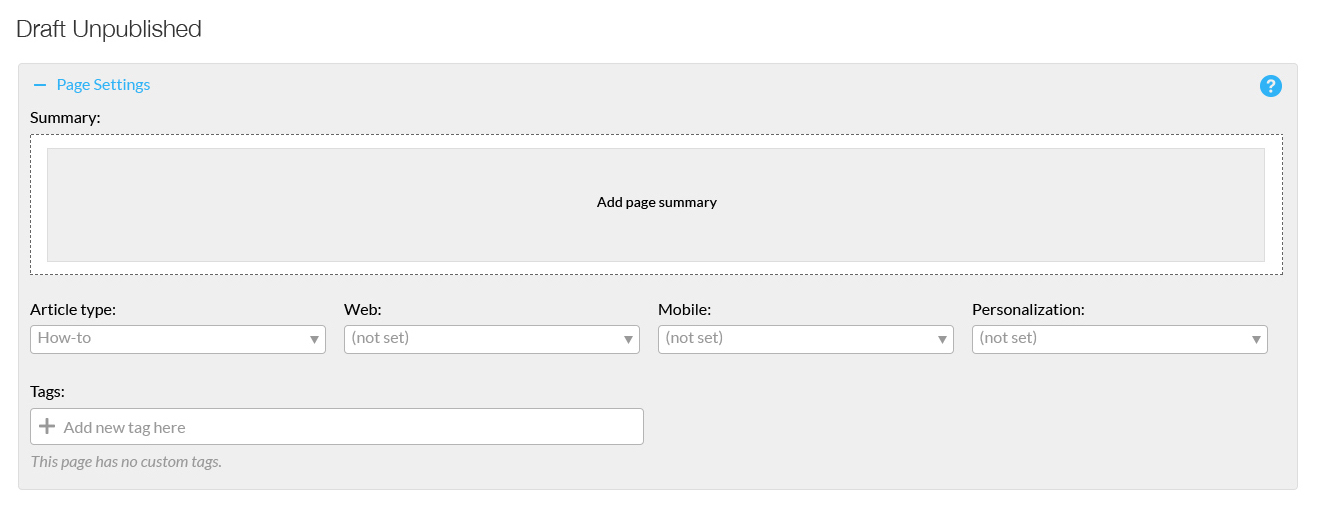
Page setting views of draft and live page unpublished
Page settings on a draft page will have slightly different controls when its live page is unpublished.
Page setting views of draft and live page without draft
The page settings view when you are editing a draft page that has a live page or just editing a live page that does not have a draft.
Page settings views of live page with draft
View of page settings on a live page that has a draft.
Responsive table views
The responsive tables are found on numerous special pages and can be affected by default table styles if added incorrectly. These tables will show or hide columns based on the screen size so keep that in mind when you style your tables.

