Button variables
- Applies to:
- All versions
- Role required:
- Admin
Buttons
There are two main types of button styles in NiCE KM: default and primary. All buttons start out with the default style and only call to action buttons are given the additional class that changes the style to NiCE KM: default and primary. All buttons start out with the default style and only call-to-action buttons are given the additional class that changes the style to primary.
Default buttons
Default buttons are based on the @highlight-color-desaturated variable and appear as a light shade of grey and a highlight color drop shadow or border on :hover, :active and :focus.
// Default button style variables
@default-button-background-color: lighten(@highlight-color-desaturated, 36%);
@default-button-background-color-hover: darken(@default-button-background-color, 20%);
@default-button-background-color-focus: darken(@default-button-background-color, 20%);
@default-button-background-color-active: darken(@default-button-background-color, 20%);
@default-button-border-color: darken(@default-button-background-color, 35%);
@default-button-border-color-hover: @highlight-color;
@default-button-border-color-focus: @highlight-color;
@default-button-border-color-active: @highlight-color;
@default-button-color: contrast(@default-button-background-color);
@default-button-color-hover: contrast(@default-button-background-color-hover);
@default-button-color-focus: contrast(@default-button-background-color-focus);
@default-button-color-active: contrast(@default-button-background-color-active);
@default-button-font-family: @default-font-family;
@default-button-hover-glow: fade(@default-button-border-color-hover, 50%);
@default-button-inner-shadow: inset .2em .1em .5em rgba(0,0,0,.3);
Primary buttons
Primary buttons are dark grey with a highlight color drop shadow or border on :hover,:active and :focus.
// Primary button style variables
@primary-button-background-color: darken(@highlight-color-desaturated, 10%);
@primary-button-background-color-hover: darken(@primary-button-background-color, 15%);
@primary-button-background-color-active: darken(@primary-button-background-color, 15%);
@primary-button-border-color: darken(@primary-button-background-color, 35%);
@primary-button-border-color-hover: darken(@highlight-color, 5%);
@primary-button-border-color-active: @highlight-color;
@primary-button-color: contrast(@primary-button-background-color);
@primary-button-color-hover: contrast(@primary-button-background-color-hover);
@primary-button-color-active: contrast(@primary-button-background-color-active);
@primary-button-inner-shadow: inset .2em .1em .5em rgba(0,0,0,.5);
Default Buttons
These buttons are the default style throughout the site. They can be found on most forms throughout the site.

Variables
These variables control the appearance of the button colors and font
- @default-button-background-color
- Default value: lighten(@highlight-color-desaturated, 36%)
- Definition: The background color used for default buttons.

- @default-button-background-color-hover
- Default value: darken(@default-button-background-color, 20%)
- Definition: The background color of a default button when a user moves their mouse over it.
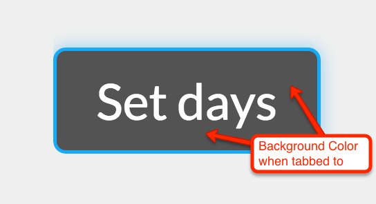
- @default-button-background-color-focus
- Default value: darken(@default-button-background-color, 20%)
- Definition: The background color of a default button when a user has tabbed to it with their keyboard.
- @default-button-background-color-active
- Default value: darken(@default-button-background-color, 20%);
- Definition: The background color of a default button when a user clicks on it or hits enter when tabbed to it.
- @default-button-border-color
- Default value: darken(@default-button-background-color, 35%);
- Definition: The border color seen on default buttons.

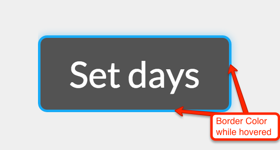
- @default-button-border-color-hover
- Default value: @highlight-color;
- Definition: The border color seen on default buttons when a user moves their mouse over it.
- @default-button-border-color-focus
- Default value: @highlight-color;
- Definition: The border color seen on a default buttons when a user has tabbed to it with their keyboard.
- @default-button-border-color-active
- Default value: @highlight-color;
- Definition: The border color seen on a default button when a user clicks on it or hits enter when tabbed to it.
- @default-button-color
- Default value: contrast(@default-button-background-color);
- Definition: The font color of the default button.

- @default-button-color-hover
- Default value: contrast(@default-button-background-color-hover);
- Definition: The font color of the default button when a user moves their mouse over it.

- @default-button-color-focus
- Default value: contrast(@default-button-background-color-focus);
- Definition: The font color of the default button when a user has tabbed to it with their keyboard.

- @default-button-color-active
- Default value: contrast(@default-button-background-color-active);
- Definition: The font color of the default button when a user clicks on it or hits enter when tabbed to it.

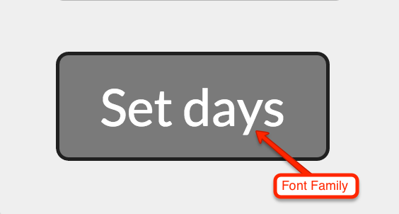
- @default-button-font-family
- Default value: @default-font-family;
- Definition: The font type used for the default button. Default font for CXone Expert Responsive is Lato.
- @default-button-hover-glow
- Default value: fade(@default-button-border-color-hover, 50%);
- Definition: The colored glow that surrounds the default button when a user hovers or focuses on it.

- @default-button-inner-shadow
- Default value: : inset .2em .1em .5em rgba(0,0,0,.3);
- Definition: The inner shadow that appears inside the default button when a user clicks or has tabbed to it with their keyboard.

Mixins
These mixins allow you to simulate the button style on elements that are not buttons but need to look like them.
Below is the default button style users see when a page loads:
.mt-button-style-default {
    background: @default-button-background-color;
    border: 1px solid @default-button-border-color;
    border-radius: @border-radius-default;
    box-sizing: border-box;
    color: @default-button-color;
    cursor: pointer;
    display: inline-block;
    font-family: @default-font-family;
    font-size: 100%;
    font-weight: normal;
    line-height: 2;
    margin: 0;
    outline: 0;
    padding: 0 .8em;
    text-align: center;
    text-decoration: none;
    text-indent: 0;
}
This is the style used when a user moves their mouse over the button:
.mt-button-style-default-hover {
    background: @default-button-background-color-hover;
    border: 1px solid @default-button-border-color-hover;
    box-shadow: 0 0 .3em @default-button-hover-glow;
    color: @default-button-color-hover;
    outline: 0;
}
This is the focus style used when a user has tabbed to the button with their keyboard:
.mt-button-style-default-focus {
    background: @default-button-background-color-focus;
    border: 1px solid @default-button-border-color-focus;
    box-shadow: 0 0 .5em @default-button-hover-glow;
    color: @default-button-color-focus;
    outline: 0;
}
This is the active style used when the user has clicked or pressed enter after tabbing to the button:
.mt-button-style-default-active {
    background: @default-button-background-color-active;
    border-color: @default-button-border-color-active;
    box-shadow: @default-button-inner-shadow;
    color: @default-button-color-active;
    outline: 0;
}
When used in the rule set of an element that is not a normal button element, copy the following nested rule set and replace the .my-fake-button selector for the one you need to use. The & is represents the primary selector and the .no-touch selector is used to distinguish between touch screen and non-touch screen devices.
.my-fake-button {
    .mt-button-style-default;
    .no-touch &:hover {
        .mt-button-style-default-hover;
    }
    &:active {
        .mt-button-style-default-active;
    }
    &:focus {
        .mt-button-style-default-focus;
    }
}
Primary Buttons
Primary buttons are used in situations where there are two or more buttons next to each other and the primary call to action needs to be identified. They are also used on Revision History pages and Article Feedback forms so they stand out from their colored parent container.

Variables
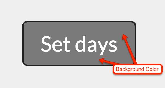
- @primary-button-background-color
- Default value: lighten(@highlight-color-desaturated, 36%)
- Definition: The background color used for primary buttons.
- @primary-button-background-color-hover
- Default value: darken(@default-button-background-color, 20%)
- Definition: The background color of a primary button when a user moves their mouse over it.
- @primary-button-background-color-focus
- Default value: darken(@default-button-background-color, 20%)
- Definition: The background color of a primary button when a user has tabbed to it with their keyboard.
- @primary-button-background-color-active
- Default value: darken(@default-button-background-color, 20%);
- Definition: The background color of a primary button when a user clicks on it or hits enter when tabbed to it.
- @primary-button-border-color
- Default value: darken(@default-button-background-color, 35%);
- Definition: The border color seen on primary buttons.

- @primary-button-border-color-hover
- Default value: @highlight-color;
- Definition: The border color seen on primary button when a user moves their mouse over it.
- @primary-button-border-color-focus
- Default value: @highlight-color;
- Definition: The border color seen on a primary button when a user has tabbed to it with their keyboard.
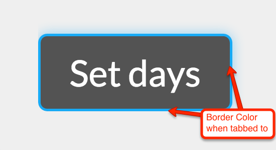
- @primary-button-border-color-active
- Default value: @highlight-color;
- Definition: The border color seen on a primary button when a user clicks on it or hits enter when tabbed to it.

- @primary-button-color
- Default value: contrast(@default-button-background-color);
- Definition: The font color of the primary button.
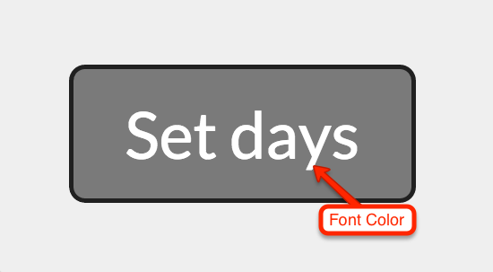
- @primary-button-color-hover
- Default value: contrast(@default-button-background-color-hover);
- Definition: The font color of the primary button when a user moves their mouse over it.

- @primary-button-color-focus
- Default value: contrast(@default-button-background-color-focus);
- Definition: The font color of the primary button when a user has tabbed to it with their keyboard.
- @primary-button-color-active
- Default value: contrast(@default-button-background-color-active);
- Definition: The font color of the primary button when a user clicks on it or hits enter when tabbed to it.
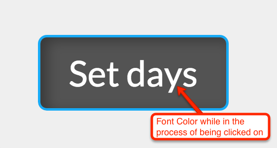
- @primary-button-font-family
- Default value: @default-font-family;
- Definition: The font type used for the primary button. Default font for CXone Expert Responsive is Lato.
- @primary-button-hover-glow
- Default value: fade(@default-button-border-color-hover, 50%);
- Definition: The colored glow that surrounds the primary button when a user hovers or focuses on it.
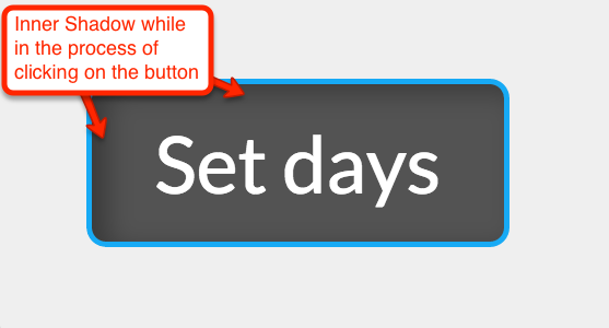
- @primary-button-inner-shadow
- Default value: : inset .2em .1em .5em rgba(0,0,0,.3);
- Definition: The inner shadow that appears inside the primary button when a user clicks or has tabbed to it with their keyboard.
Mixins
These mixins allow you to simulate the primary button style on elements that are not buttons but need to look like them.
This is the primary button style users see when a page loads.
.mt-button-style-primary {
    background: @primary-button-background-color;
    border: 1px solid @primary-button-border-color;
    border-radius: @border-radius-default;
    box-sizing: border-box;
    color: @primary-button-color;
    cursor: pointer;
    display: inline-block;
    font-family: @primary-font-family;
    font-size: 100%;
    font-weight: normal;
    line-height: 2;
    margin: 0;
    outline: 0;
    padding: 0 .8em;
    text-align: center;
    text-decoration: none;
    text-indent: 0;
}
This is the style used when a user moves their mouse over the button.
.mt-button-style-primary-hover {
    background: @primary-button-background-color-hover;
    border: 1px solid @primary-button-border-color-hover;
    box-shadow: 0 0 .3em @primary-button-hover-glow;
    color: @primary-button-color-hover;
    outline: 0;
}
This is the focus style used when a user has tabbed to the button with their keyboard:
.mt-button-style-primary-focus {
    background: @primary-button-background-color-focus;
    border: 1px solid @primary-button-border-color-focus;
    box-shadow: 0 0 .5em @primary-button-hover-glow;
    color: @primary-button-color-focus;
    outline: 0;
}
This is the active style used when the user has clicked or pressed enter after tabbing to the button:
.mt-button-style-primary-active {
    background: @primary-button-background-color-active;
    border-color: @primary-button-border-color-active;
    box-shadow: @primary-button-inner-shadow;
    color: @primary-button-color-active;
    outline: 0;
}
When used in the rule set of an element that is not a normal button element, copy the following nested rule set and replace the .my-fake-button selector for the one you need to use. The & is represents the primary selector and the .no-touch selector is used to distinguish between touch screen and non-touch screen devices.
.my-fake-button {
    .mt-button-style-primary;
    .no-touch &:hover {
        .mt-button-style-primary-hover;
    }
    &:active {
        .mt-button-style-primary-active;
    }
    &:focus {
        .mt-button-style-primary-focus;
    }
}
Icon Buttons
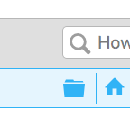
If the element initiates an action, then it is built with a button, but not all buttons in NiCE KM look like buttons. Some buttons have only an icon or an icon and text. These are called icon buttons and have their own unique variable and mixins. Some of the more common icon buttons are the hierarchy collapse/expand button found in the header (folder icon), the table of contents collapse/expand button, and the Article Feedback buttons.


Variables
This variable is used to control the appearance of an icon button active state dotted outline which is used for accessibility reasons. The default color of icon buttons is determined by the @primary-link-color variable.
Mixins
These mixins allow you to use the icon button styles on any element you choose.
.mt-button-style-icon {
    background: none;
    border: 0;
    box-shadow: none;
    color: @primary-link-color;
    line-height: 1;
    padding: 0;
}
.mt-button-style-icon-active {
    color: @primary-link-color-active;
    outline: @icon-button-outline-color-active dotted 1px;
    padding: 0;
}
