Resize table columns
In NiCE KM, newly created tables are automatically set to responsive. Whether you use the default widths of your columns or resize the columns, the table's responsiveness persists.
Tables created before implementation of the responsive table option need to be manually updated through the editor's table properties dialog. Existing tables are not updated retroactively and will display as originally entered.
The change to responsive columns
Before the responsive option was added to the table dialog, column widths were set inline with hard-coded pixels. This worked for skins that had a fixed width content container, but prevented a truly responsive table display on smaller screens. With the implementation of the responsive option, table column widths are set with class names that render width in percentages instead. This allows the table to have the right proportions in all screen sizes.
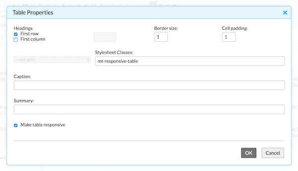
Resize table columns
- Right-click anywhere in the table.
- Select Table properties from the context menu.
- Check the Make table responsive checkbox if not yet checked.
- Click OK.
- Drag the dashed column border to the desired width.