Traffic Insights Report
The Traffic Insights Report provides helpful data for you to discover what types of traffic arrives at your site, the origins of that traffic, and how visitors are accessing your site.
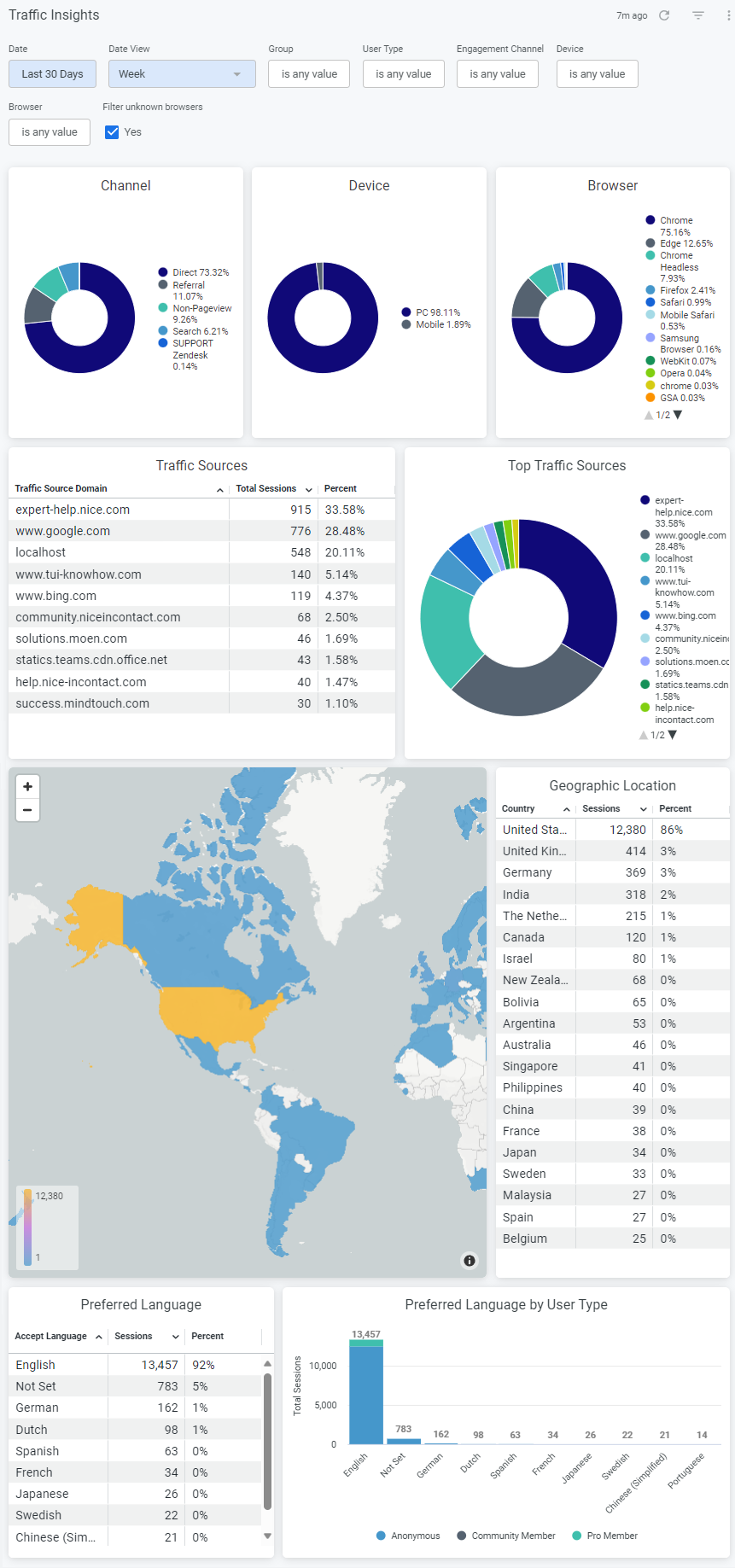
The report shows traffic origin of the user who navigates to your site by: device, channel, browser, traffic sources, geographic location, and preferred language. The data provides context as to your global reach and how your site visitors interact with your content.
- Channel: Identifies what channel visitors are using to enter your site.
There is an article with more information on non-pageview channel. - Device: Awareness of how many customers use mobile, desktop or tablet.
Knowing the size of the device is important in UX design for responsive content and mobile vs. web layouts. - Browser: Information on what browsers site visitors are using.
This can help you optimize design for all users. - Traffic Sources: Data on what external links are sending customers to your site.
- Geographic Location: View geographic location of visitors by country.
- Preferred Language: See the preferred language of site visitors, as set by the user's web browser.
Access the Traffic Insights Report
Navigate to Site tools > Dashboard > Customer Experience Reports > Traffic Insights.
- The Traffic Insights report can be accessed by Admin users.
- The report includes export options to download or email the data.
Report components
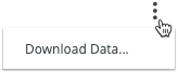
Export options (gear icon  )
)
- Download as PDF
- Download as CSV
- Send (email report immediately)
- Schedule (email report on a schedule)
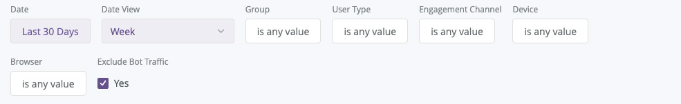
Filters and Run
- Date
- Date View
- Group
- User Type
- Page Type
- Run button
Data
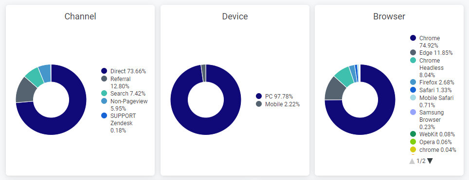
Channel, Device, and Browser breakdowns
Format: Donut charts display information about what channels users come from, the device your visitors are using, and their browsers.
Insights:
Channel: The ability to understand what channels visitors enter your site through can influence how you structure your site.
If your support team is providing most of your traffic, you may wish to increase your presence on your marketing site to give users another entry point to self-service. There is an article with more information on utility engagement (non-pageview channel).
Device: Understanding which devices users are engaging your content on can provide you with insights for responsive design initiatives. You can use this information to improve your UX for users of all devices.
Browser: Knowing what browsers your users access your content with helps you understand if there are branding changes you might consider.
Because not every browser process codes the same way, this information can help you ensure the best user experience by knowing what browsers you should optimize for.
Interaction options
- Hover over a tile to show and click 3 dots menu for Download Data options.
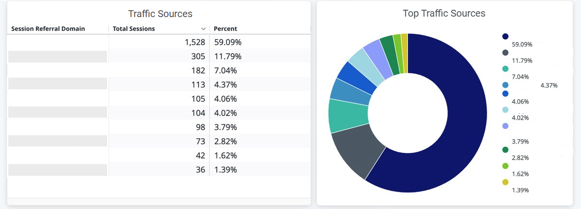
Traffic Sources
Format: Learn more about the sites that users come to your site from. View top traffic sources based on sessions in the table chart, and a breakdown of top sources in the donut chart.
Insights: Knowing how traffic is being directed to your site gives you a view into the interactions your customers have with your support team, Google, and links on your marketing site.
Interaction options:
- Hover over a tile to show and click 3 dots menu for Download Data options.
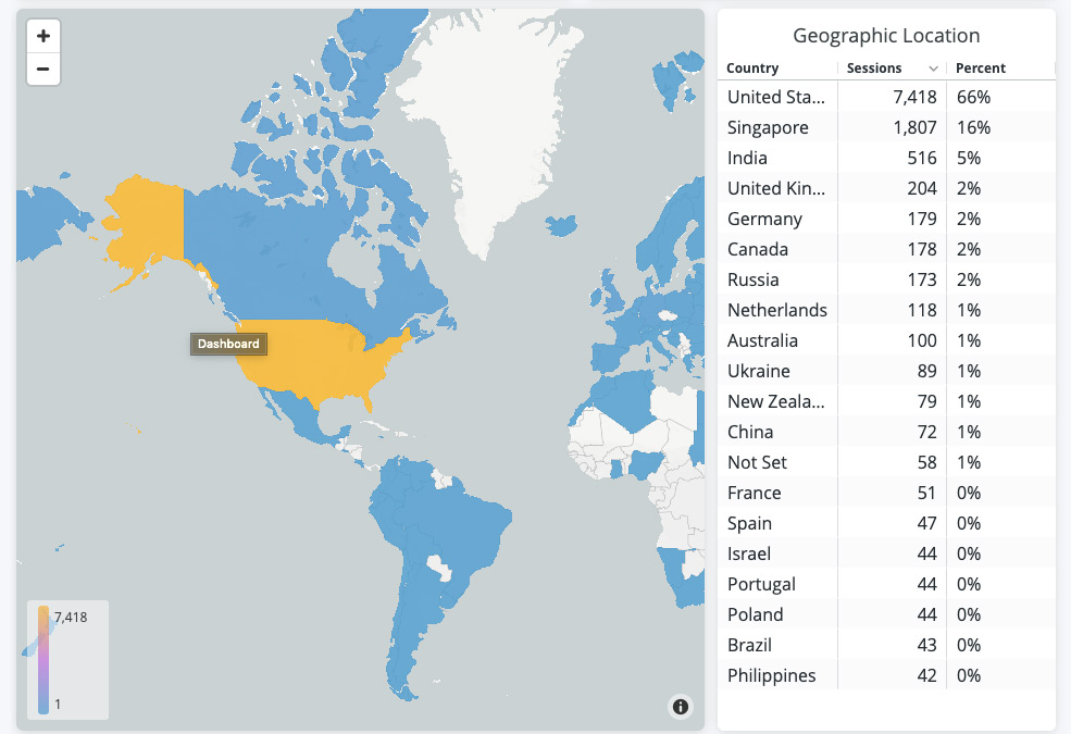
Geographic Location
Format: View the geographic location of your visitors by country. Top locations are based on the total amount of sessions displayed in a table. Use the map to see the location of users; color denotes the amount of sessions.
Insights: Knowing where your audience lives and where traffic is navigating from allows you to decide what areas of the world are important for your strategic efforts.
This can include translation and localization work, dedicated language sites, or local marketing campaigns that focus on high-impact geographies.
Interaction options:
- Hover over a tile to show and click 3 dots menu for Download Data options.
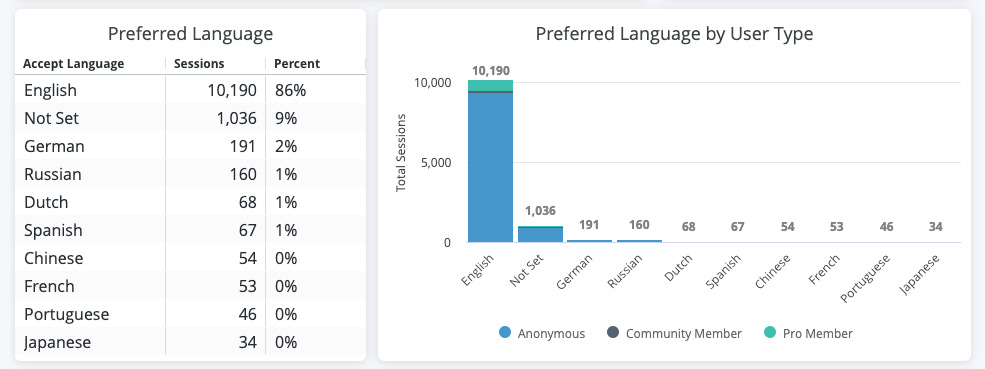
Preferred Language
Format: View your visitors' preferred languages. Preferred language is tracked by the preferred language set in a user's web browser.
Top languages are based on total amount of sessions, displayed in a table. Use the stacked bar chart to view the top languages, and the break-down of user types for each preferred language.
Interaction options:
- Hover over a tile to show and click 3 dots menu for Download Data options.
Filter tips
- Auto-suggest: For Group, User Type, and Page Type filters, click into each filter field with is equal to (default) filter type selected to trigger the auto-suggest options before using other filter types.
- Filter field entries: Ensure selected filter field entries are accepted with grey background before clicking Run. Filter field entries are case sensitive.
Considerations
- The data for this report has been collected since 01/01/2018 and is current through each previous day due to nightly data processing.
- Depending on query size, data may take up to a minute to load. A spinning wheel indicator will appear until each data component loads, and the Stop button will change to Run when all components complete loading.
- Data settling period: The data for the most recent previous day should be considered incomplete and will likely increase (usually by less than 1%) the following day.
- The report times out after 1 hour of inactivity - refresh your browser to reconnect or see 401 error troubleshooting.
- Report labels are not localized on non-English NiCE KM sites.
- The report service, powered by Looker, has weekly maintenance hours when reports may be unavailable.
- Sunday and Wednesday: 4am-6am UTC (9pm-11pm Pacific)