Dialog variables
- Applies to:
- CXone Mpower Expert (current)
- Role required:
- N/A
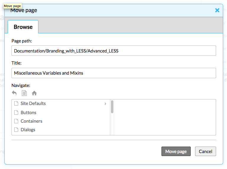
Dialogs are accessible by Pro Members only. They provide additional controls for features such as content management, link pickers, attaching images, etc.
Branding dialogs


Variables
- @dialog-border-color
- Default value: @highlight-color
- Definition: The border color of the dialog container.

- @dialog-border-radius
- Default value: .5em
- Definition: The rounded corners of the dialog container.

- @dialog-box-shadow
- Default value: 0 0 1em fade(@default-button-border-color-hover, 25%)
- Definition: The glow that surrounds the outside of the dialog container. It is based off the site's highlight color.

Mixin
.dialog-style {
    border: 1px solid @dialog-border-color;
    border-radius: @dialog-border-radius;
    box-shadow: @dialog-box-shadow;
    box-sizing: border-box;
}
CSS
Here is an example of how the mixin is used in a rule set.
.ui-dialog {
    .dialog-style;
    background: @background;
    font-size: 95%;
    padding: 0;
}
