
Add custom styles to Editor
- Applies to:
- All versions
- Role required:
- Admin
The original editor includes preformatted styles by default, but site administrators can configure custom options to appear in the Style drop-down menu in the Editor.
Create inline custom styles to:
- Apply a certain style to text or tables
- Reuse a text style across your site
- Modify style through a global CSS change
This page is for the original editor experience. You can add Custom Styles to the Enhanced Editor from the Dashboard.
Part 1: Add custom style options to the editor
- Navigate to Site tools > Control panel > System Settings > Editor.
- In the Set editor configuration field, add the following sample code:
CKEDITOR.editorConfig = function( config ) { config.stylesSet.push({ name : 'Custom div 1', element : 'div', wrap:true, attributes : { 'class' : 'custom1', 'title' :'Custom_Class1' } }); config.stylesSet.push({ name : 'Custom span 2', element : 'span', wrap:false, attributes : { 'class' : 'custom2', 'title' :'Custom_Class2' } }); }; - Modify the sample code for your custom styles, adding additional lines as needed.
- name: The name that you want to appear in the Styles drop-down menu (Custom div 1 and Custom span 2 in the sample code).
- element: The designated element the style is applied to.
- wrap: Denotes that the element is a block level element, which applies to <div> or <paragraph> elements. For non-block level elements such as <span> or <code>, set this attribute to false or omit the wrap component entirely.
- attributes: The sample code identifies a class (custom1, custom2) and a title (Custom_Class1, Custom_Class2) for the style.
- Click Save to add the custom styles to the editor configuration.
Part 2: Define the CSS format
- Navigate to Site tools > Control panel > Branding > Custom Site CSS.
- Add your custom CSS to style your custom classes.
Part 3: Use your custom styles
- Open a page in Edit mode.
- Highlight text or an element on the page
- Select your custom class from, the Style drop-down menu.
To remove the custom style from the text, highlight the text and select the custom style again or select a different style.
Example
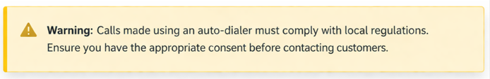
The following is a pre-built custom style that you can use or modify. It will add a gold "Warning" box that looks like this:
.png?revision=1)
Part 1: Under Site tools > Control panel > System Settings > Editor, in the Set editor configuration field, add the following code, then save.
CKEDITOR.editorConfig = function( config ) {
    config.stylesSet.push({ name : 'Warning', element : 'div', wrap:true, attributes : { 'class' : 'mt-warning-container', 'title' :'Warning' } });
};
Part 2: Under Branding > Custom Site CSS, add the following CSS to the appropriate role field, then save.
.mt-warning-container{
 align-items: flex-start;
 background-color: @background;
 border: 1px solid #d9d9d9;
 border-radius: .25em;
 -webkit-box-shadow: 0 8px 10px 1px rgba(0,0,0,.14), 0 3px 14px 2px rgba(0,0,0,.12), 0 5px 5px -3px rgba(0,0,0,.2);
 box-shadow: 0 .55em .7em .05em rgba(0,0,0,.14), 0 .15em 1em .1em rgba(0,0,0,.12), 0 .35em 0.4em -.25em rgba(0,0,0,.2);
 color: #333;
 display: flex;
    .default-font-declaration(normal; 100%; 1.2; @default-font-family);
 margin: 2.25em 1em;
 padding: 1em;
}
 @media all and (max-width: 37.5em) {
 .mt-warning-container,
 .mt-note-container {
 margin: 2.25em 1%;
        }
    }
.mt-warning-container:before{
 flex: 0 0 auto;
    .icon-font-declaration(normal; 175%; 1; @icon-font-family);
 margin: 0 .5em 0 0;
 white-space: nowrap;
}
.mt-warning-container:before {
 color: #f6b221; gold
 content: '\e6f5';
}

.mt-warning-container p{
 color: #333;
 line-height: 1.7;
 margin: 0;
}